Introduction
We've all probably heard about the HTML dialog element, popover API, and customizable select, but I think a lot of people don't realize how powerful and battle-tested they are and also might not know about some of the inconsistencies these elements have and that they might encounter when using them. And this is what this post is about, I'm not going to go over the syntax and basic API's, if you're unfamiliar with them, I would suggest you read some MDN pages and Chrome For Devs blog posts before you jump into this article. I would like to focus more on in-depth details and edge cases. The article will be a comparison between these native elements and UI libraries like Shadcn, React Aria, etc.
Let's start by listing out some of the common features you would expect from a robust dialog, select, or popover, whether it's native or custom JS one.
- Keyboard-navigatable: if it's a dialog, it should be focus trapped, it's a select, it should navigate using arrow keys, etc.
- Escape key dismissal
- These floating element/pop ups should, under all circumstances, appear above the rest of the page content, and as we will see, there are different mechanisms to approach this.
- Mobile back button/swipe gesture: you probably didn't think about it, but on desktop, you use Escape key to close, but what do you do on mobile? If you're like me on Android, you can close things using the back button or swipe gesture, our dialog/select should support that too, otherwise, it's gonna jump the browser back in history, which creates a bad user experience, especially if we're building something that will be heavily used by mobile users, like a social media app or something, I've tested this on multiple social media apps like Facebook and Twitter (not going to call it X whatsoever), they all, either fully or partially, support back button press in some form. For example, on Facebook, I tried every possible menu or dialog I could think of, and they all close when I hit back button (and it's awesome).
I don't know if I missed something, but let's just focus on these four features for now and see how native elements vs UI libraries approach them, as we'll see, there's a lot to unpack in here.
For keyboard navigation and Escape key dismissal, the HTML dialog, select, popover, and all the upcoming elements have this built-in, you almost don't need any JavaScript at all for any of this to work, but for JS libraries, it's an entirely different story, you'd be shipping tons and tons (or even hundreds) of lines of JS for Escape key dismissal, arrow keys navigation, focus trapping, etc. All of this just to re-invent what the browser gives you for free.
For back button/swipe gesture, this is also already built-in in the native components, all of them close on back button press on Android, but in UI libraries like Radix UI or React Aria, they don't even have this feature at all, despite that it can be added using JavaScript.
In order to add support for back button press and swipe gestures, you can use the CloseWatcher API, as MDN says: it allows a custom UI component with open and close semantics to respond to device-specific close actions in the same way as a built-in component.
The browser compatibility for the CloseWatcher API is decent, it's been in Chrome and Edge since June 2024, Firefox added it in May this year (2026), it's not available in Safari yet, but this is a progressive enhancement feature, if it's available, your users are going to enjoy a better experience, if it's not, it's not a big deal. Also, you can build this same behavior using the HistoryAPI if you need it that much.
The Top Layer
One thing I want to compare is how native elements and UI libraries make sure things appear on top of other page content and also above each other. To better explain this, let's take the following example from Notion webapp, here we have the settings dialog and inside we have a select that we can choose our preferred theme from. The question is how do we ensure the dialog appears above other content and the select appears above the dialog.
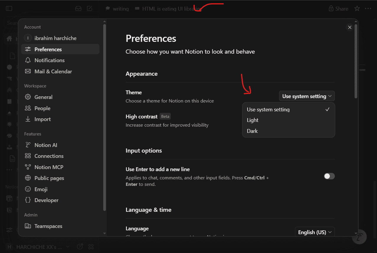
For our native elements, the answer is the Top Layer, each of our dialog and select will live in Top Layer, a separate layer that the browser maintains internally, it allows our elements to appear on top of all other stuff in the DOM, and it bypasses any stacking context that could be locking it and beats any z-index value, even your favorite 9999, if more than one element exists in the Top Layer, they're going to be stacked on top of each other according to the order they were opened in.
The example above is using the dialog and select elements, if you're using Chrome, keep both of them open, then use the devtools to see the Top Layer at the bottom of HTML documents.
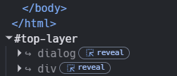
The fact that stuff like dialog and popover lives in Top Layer has an important implication; it doesn't matter where you put them in your HTML markup. Even if your element is nested deep in the DOM or inside an element that has a z-index of 2, opacity of 0.5, or any other css property that creates a stacking context. the dialog will still show up above all other content.
What about JS libraries? How do they handle this?
You might think that the answer is managing stacking context, but that is not true. Managing stacking context could turn into a nightmare, especially if you have a lot of floating elements in your UI. A simple transform or opacity can lock an element behind a certain stacking context level (good luck debugging that), that's why native elements use Top Layer and don't let you manage stacking context manually in the first place. The front end developer community has learned this and moved toward a better approach, and it's what all UI libraries use (portals).
The way portals work is pretty simple, instead of putting the floating element next to its trigger in the DOM, i.e., a dialog next to a button that opens it, and start fussing with z-index. Let's just put the element at the end of the body element and use JavaScript to position according to its anchor (if needed). This way, none of its parents is gonna have a stacking context locking it.
if we have more than one element that needs to appear above other content, we're going to stack them, add the dialog first, then add the select.
This second example is using Shadcn/React Aria dialog and select components, it's quite hard to see them in the devtools because there's a lot of DOM nodes and wrappers that the library is adding for things like overlays and accessibility, but if you inspect, you'll see something like this:
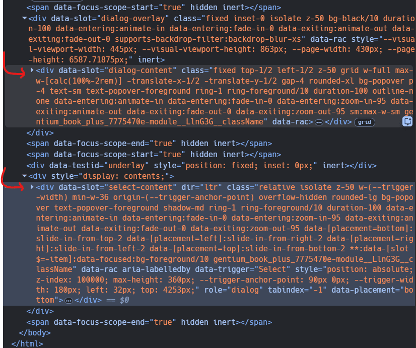
There are a lot of details in here, but what we care about is the structure and order; how the elements are appended to the end of thebody element and how the dialog comes first (first arrow) then the select (second arrow).
You might have noticed something interesting in here; both Portals and Top Layer fix the exact same problem, the complexity of managing stacking context, and both work very similarly, stack elements in their order of opening and put in a place where they're very unlikely to be affected by CSS properties like z-index. The difference is how it's done, Top Layer requires no JavaScript to work, the stack of opened elements is maintained internally by the browser, while Portals use JavaScript to keep track of all opened elements, whether they're dialogs, menus, whatever, and close them in order.
That last statement is as important as the first, the reason why we need to keep a stack of opened elements isn't to just manage their visibility (display in order), but also to make sure they close in order; in the two demos above, if you hit Escape key or click outside (light dismiss), the select will close first, then you have to hit Escape or click outside one more time for the dialog to close second.
Closing on back button in order? As I mentioned, it only works with native elements, libraries can actually provide this functionality with CloseWatcher's or History API, but for some reason they don't!
The Inconsistencies with Combining Top Layer and Portals
After we discussed how Top Layer and Portals work, the last thing I want to draw your attention to is what happens when you combine both of them, because you're very likely to do so if you decided to use native elements.
As we've seen, there are three types of elements that can live in Top Layer as of now, dialog, popovers, and customizable select, if you happen to need something beyond that, say a menu, you would like to reach for your favorite UI library, and that's where things get interesting and also inconsistent.
So let's say you're working on a dialog with a menu inside of it, and you decided to use the battle-tested HTML dialog element and some UI libraries for your menu, say Shadcn. The problem you're gonna have is that the dialog lives in Top Layer, but your Shadcn menu is a portal, which means even if you nest it inside the dialog element, it is going to be appended at the end of the body element.
Since the dialog element lives in top layer, it is going to appear on top of your menu instead of the menu being on top of it. This happens because as we've mentioned earlier, things in top layer appear above all other content in the web page.
// although in the code the DropDownMenu is nested inside the dialog, the library will use React portals to mount it at the end of the body element.
<dialog>
  <DropdownMenu>
    <DropdownMenuContent>
      <DropdownMenuItem>Profile</DropdownMenuItem>
      <DropdownMenuItem>Billing</DropdownMenuItem>
      <DropdownMenuItem>Settings</DropdownMenuItem>
    </DropdownMenuContent>
  </DropdownMenu>
</dialog>
This problem doesn't have a straightforward fix, because we can't force our Shadcn menu to go into Top Layer. The Top Layer is managed internally by the browser. This leaves us with two choices to get our menu to appear above the dialog.
The first option we have is to rely on stacking context: instead of appending our menu to the end of the body element, we'll insert it inside the dialog element in Top Layer, this will make it follow its stacking context.
most UI libraries provide a way, e.g., a container property, to choose where your portal elements are mounted.
The second option is to only use these elements when we don't have anything nested inside of them that doesn't have a native element that lives in Top Layer.
not yet having enough elements that live in Top Layer shouldn't prevent us from using these elements at all, if your dialog doesn't have something like a menu or datepicker inside of it, e.g just a standalone dialog, you can still use the dialog element without worrying about managing stacking context or things showing below each other.
Is Anyone Using This Stuff?
Yes, LinkedIn uses dialog and popover in many places across their site, MDN is using the dialog element for their search box, I'm using them for a Chrome Extension with nine users, and you should too.